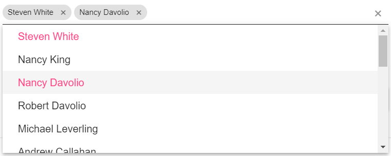
MultiSelect is a Kendo UI control that transforms a select element into a nice dropdown with text filtering which allows the selection of multiple items. This is how you use the same control to write values directly in the list, something akin to the Outlook address bar functionality.

  Long story short: the control exposes some events like: 'filtering','open','close' and 'change'. In the filtering event, which is fired by someone writing or pasting text in order to filter the list of items, we dynamically create a list item that holds that value, so that the user can just press Enter and enter the value in the list. The code also allows for a custom transformation function, so for example someone could enter "1,2,3" and it would be translated into three values 1, 2 and 3 instead of an item with the value "1,2,3". On the close and change events we clear the items in the list that have not been selected. This means you cannot use this code as is to show an autocomplete list and also add dynamic values, but it is easy to tweak for that purpose.

  In order to use it, instead of doing $(selector).kendoMultiSelect(options), just use $(selector).kendoDynamicMultiSelect(options). Here is the code:

$.fn.kendoDynamicMultiSelect = function (options) {
  var multiSelect = $(this).kendoMultiSelect(options).getKendoMultiSelect();

  multiSelect.bind('filtering', function (ev) {
    var val = ev.filter && ev.filter.value;
    if (!val) return;
    
    var dataSource = ev.sender.dataSource;
    var items = dataSource.data();
    
    // if there is an existing item in the list, don't create a new one
    var existingItem = items.filter(function (i) {
      return i.value == val;
    })[0];
    if (existingItem) return;

    // find or create the item that will hold the current filter value
    var inputItem = items.filter(function (i) {
      return i.isInput;
    })[0];
    if (!inputItem) {
      inputItem = dataSource.insert(0, { isInput: true });
      // when inserting a value the input gets cleared in some situations
      // so set it back 
      ev.sender.input.val(ev.filter.value);
    }
    inputItem.value = val;
  });

  // cleans input items and also applies an optional value transformation function
  var updateValues = function (ev) {
    var values = ev.sender.value();
    if (typeof options.valueTransformationFunction === 'function') {
      // for example split comma separated values
      values = options.valueTransformationFunction(values);
    }

    var dataSource = ev.sender.dataSource;
    var items = dataSource.data();
    for (var i = 0; i < items.length; i++) {
      var item = items[i];
      item.shouldBeKept = false;
    }

    // add items for existing values
    for (var i = 0; i < values.length; i++) {
      var value = values[i];
	    
      var item = items.filter(function (i) { return i.value == value; })[0];
      if (!item) {
        item = dataSource.add({ value: value });
      }
      item.isInput = false;
      item.shouldBeKept = true;
    }

    ev.sender.value(values);

    // delete all others
    for (var i = 0; i < items.length; i++) {
      var item = items[i];
      if (!item.shouldBeKept) {
        dataSource.remove(item);
      }
    }
  };

  multiSelect.bind('change', updateValues);
  multiSelect.bind('close', updateValues);
};

I kind of copied this code by hand and tried it on another computer. If you find any bugs, let me know. Also, I know this is old time tech, but they use it in my company and I couldn't find this functionality by googling it, so here it is.

I hope it helps.

  A little gem I stumbled upon today that I didn't know about: https://placeholder.com/. You use it really simple like https://via.placeholder.com/300x150?text=Placeholder, but there is also a shorter URL that looks like this: https://placehold.it/1280x800/8020A0/FFFFFF?text=Siderite's blog.

  The simplest syntax is https://placehold.it/300 (a 300x300 image that displays "Placeholder" and "Powered by HTML.COM").

As you possibly know, I am sending automated Tweets whenever I am writing a new blog post, containing the URL of the post. And since I've changed the blog engine, I was always seeing the Twitter card associated with the URL having the same image, the blog tile. So I made changes to display a separate image for each post, by populating the og:image meta property. It didn't work. The Twitter card now refused to show the image. And it was all because the URL I was using was relative to the blog site.

First of all, in order to test how a URL will look in Twitter, use the Twitter Card validator. Second, the Open Graph doesn't specify that the URL in og:image should be absolute, but in practice both Twitter and Facebook expect it to be.

So whenever populating Open Graph meta tags with URLs, make sure they are absolute, not relative.

I've stumbled on an article called Create A Dark/Light Mode Switch with CSS Variables which explains how to style your site with CSS variables which you can then change for various "themes". Her solution is to use a little Javascript - and let's be honest, there is nothing wrong with that, everything is using Javascript these days, but what if we mix this idea with "the CSS checkbox hack" as explained in Creating useful interactive elements using only CSS, or "The Checkbox Hack"? Then we could have a controllable theme in our website without any Javascript.

Just in case these sites disappear, here is the gist of it:
  1. Define your colors in the root of the document with something like this:
    :root {
    --primary-color: #302AE6;
    --secondary-color: #536390;
    --font-color: #424242;
    --bg-color: #fff;
    --heading-color: #292922;
    }
  2. Define your themes based on attributes, like this:
    [data-theme="dark"] {
    --primary-color: #9A97F3;
    --secondary-color: #818cab;
    --font-color: #e1e1ff;
    --bg-color: #161625;
    --heading-color: #818cab;
    }
  3. Use the colors in your web site like this:
    body {
    background-color: var(--bg-color);
    color: var(--font-color);

    /*other styles*/
    .....
    }
  4. Change theme by setting the attribute data-theme to 'dark' or 'light'
Now, to use the CSS checkbox hack, you need to do the following:
  1. Wrap all your site in an element, a div or something
  2. Add a checkbox input on the same level as the wrapper and styled to be invisible
  3. Add a label with a for attribute having the value the id of the checkbox
  4. Add in the label whatever elements you want to trigger the change (button, fake checkbox, etc)
  5. Change the theme CSS to work not with [data-theme="dark"], but with #hiddenCheckbox:checked ~ #wrapper, which means "the element with id wrapper that is on the same level as the checkbox with id hiddenCheckbox"
This means that whenever you click on the label, you toggle the hidden checkbox, which in turn changes the CSS that gets applied to the entire wrapper element.

And here is a CodePen to prove it:

See the Pen
rbzPmj
by Siderite (@siderite)
on CodePen.

Kind of obvious, but I wanted to make it clear and to remember it for the future. You want to make something appear or not based on a toggle button, usually done by adding a click handler on an element with some code to determine what happens. But you can do it with HTML and CSS only by using the label element pointing to a hidden checkbox with its for attribute. Example:

   I have been toggled!

Here is the HTML and CSS for it:
<style>
/* you have to use a caption element instead of a control element inside the label, so a button would not work and we use a span to look like a button */
.button {
border: solid 1px gray;
padding: 5px;
display: inline-block;
user-select: none;
cursor: pointer;
}
 
/* the element after the unchecked checkbox is visible or not based on the status of the checkbox */
#chkState + span { display: none; }
#chkState:checked + span { display: inline-block; }
</style>
<label for="chkState">
<span class="button">Toggle me!</span>
</label>
&nbsp;&nbsp;&nbsp;
<input type="checkbox" style="display:none" id="chkState" />
<span>I have been toggled!</span>

Update: You might want to use an anchor instead of a span, as browsers and special software will interpret it as a clickable, but not input control.

Update: You can, in fact, instruct the browser to ignore click events on a button by styling it with pointer-events: none;, however that doesn't stop keyboard events, so one could navigate to the button using keys and press Space or Enter and it wouldn't work. Similarly one could try to add an overlay over the button and it still wouldn't work for the same reason, but that's already besides the point. Anyway, either of these solutions would disable the visual style of the clicked button and web sites usually do not use the default button style anyway.

There is one reason why you should not use this, though, and that is usability. I don't know enough about it, though. In theory, a label should be interpreted the same as the checkbox by software for people with disabilities.

There is this channel I am subscribed to, with various people discussing or demonstrating software development concepts, with various degrees of success. I want to tell you about this series called CSS3 in 30 Days which is very well organized and presented by a clearly talking and articulate developer, Brad Hussey. He's nice, he's Canadian.

And before you go all "I am a software programmer, not a web designer", try watching it for a bit. Personally I am sure I would have solved a lot of what he demos using Javascript. Changing your perspective is a good thing. Note it is about CSS3, which had quite a few improvements over the classical CSS you may know already.

Here is the first "day" of the tutorial:

I am sure I've tested this, but for some reason the icons in my blog disappeared for Internet Explorer. They are using Font Awesome SVG background images, declared something like this:
.fas-comment {
background-image: url("data:image/svg+xml;utf8,<svg height='511.6' version='1.1' viewBox='0 0 511.6 511.6' width='511.6' x='0' xml:space='preserve' xmlns='http://www.w3.org/2000/svg' y='0'><g fill='#2f5faa'><path d='M477.4 127.4c-22.8-28.1-53.9-50.2-93.1-66.5 -39.2-16.3-82-24.4-128.5-24.4 -34.6 0-67.8 4.8-99.4 14.4 -31.6 9.6-58.8 22.6-81.7 39 -22.8 16.4-41 35.8-54.5 58.4C6.8 170.8 0 194.5 0 219.2c0 28.5 8.6 55.3 25.8 80.2 17.2 24.9 40.8 45.9 70.7 62.8 -2.1 7.6-4.6 14.8-7.4 21.7 -2.9 6.9-5.4 12.5-7.7 16.9 -2.3 4.4-5.4 9.2-9.3 14.6 -3.9 5.3-6.8 9.1-8.8 11.3 -2 2.2-5.3 5.8-9.9 10.8 -4.6 5-7.5 8.3-8.8 9.9 -0.2 0.1-1 1-2.3 2.6 -1.3 1.6-2 2.4-2 2.4l-1.7 2.6c-1 1.4-1.4 2.3-1.3 2.7 0.1 0.4-0.1 1.3-0.6 2.9 -0.5 1.5-0.4 2.7 0.1 3.4v0.3c0.8 3.4 2.4 6.2 5 8.3 2.6 2.1 5.5 3 8.7 2.6 12.4-1.5 23.2-3.6 32.5-6.3 49.9-12.8 93.6-35.8 131.3-69.1 14.3 1.5 28.1 2.3 41.4 2.3 46.4 0 89.3-8.1 128.5-24.4 39.2-16.3 70.2-38.4 93.1-66.5 22.8-28.1 34.3-58.7 34.3-91.8C511.6 186.1 500.2 155.5 477.4 127.4z'/></g></svg>");
}

I had to try several things, but in the end, I found out that there are three steps in order to make this compatible with Internet Explorer (and still work in other browsers):
  1. The definition of the utf8 charset must be explicit: data:image/svg+xml;charset=utf8 instead of data:image/svg+xml;utf8
  2. The SVG code needs to be URL encoded: so turn all double quotes into single quotes and then replace < and > with %3C and %3E or use some URL encoder
  3. The colors need to be in rbg() format: so instead of fill='#2f5faa' use fill='rgb(47,95,170)' (same in style tags in the SVG, if any)


So now the result is:
.fas-comment {
background-image: url("data:image/svg+xml;charset=utf8,%3Csvg height='511.6' version='1.1' viewBox='0 0 511.6 511.6' width='511.6' x='0' xml:space='preserve' xmlns='http://www.w3.org/2000/svg' y='0'%3E%3Cg fill='rgb(47,95,170)'%3E%3Cpath d='M477.4 127.4c-22.8-28.1-53.9-50.2-93.1-66.5 -39.2-16.3-82-24.4-128.5-24.4 -34.6 0-67.8 4.8-99.4 14.4 -31.6 9.6-58.8 22.6-81.7 39 -22.8 16.4-41 35.8-54.5 58.4C6.8 170.8 0 194.5 0 219.2c0 28.5 8.6 55.3 25.8 80.2 17.2 24.9 40.8 45.9 70.7 62.8 -2.1 7.6-4.6 14.8-7.4 21.7 -2.9 6.9-5.4 12.5-7.7 16.9 -2.3 4.4-5.4 9.2-9.3 14.6 -3.9 5.3-6.8 9.1-8.8 11.3 -2 2.2-5.3 5.8-9.9 10.8 -4.6 5-7.5 8.3-8.8 9.9 -0.2 0.1-1 1-2.3 2.6 -1.3 1.6-2 2.4-2 2.4l-1.7 2.6c-1 1.4-1.4 2.3-1.3 2.7 0.1 0.4-0.1 1.3-0.6 2.9 -0.5 1.5-0.4 2.7 0.1 3.4v0.3c0.8 3.4 2.4 6.2 5 8.3 2.6 2.1 5.5 3 8.7 2.6 12.4-1.5 23.2-3.6 32.5-6.3 49.9-12.8 93.6-35.8 131.3-69.1 14.3 1.5 28.1 2.3 41.4 2.3 46.4 0 89.3-8.1 128.5-24.4 39.2-16.3 70.2-38.4 93.1-66.5 22.8-28.1 34.3-58.7 34.3-91.8C511.6 186.1 500.2 155.5 477.4 127.4z'/%3E%3C/g%3E%3C/svg%3E");
}

I've noticed an explosion of web sites that try to put all of their stuff on a single page, accessible through nothing else than scrolling. Parallax effects, dynamic URL changes as you scroll down, self arranging content based on how much you have scrolled, videos that start and stop based on where they are placed in the viewbox, etc. They're all the rage now, like web versions of pop-up books. And, as anything that pops up at you, they are annoying! I know creativity in the design world means copying the hell out of whoever is more fashionable, but I really really really would want people to stop copying this particular Facebook++ type, all slimy fingers on touchscreens abomination.

Take a look at inc.com, for example. Reading about brain hacking and scrolling down I get right into Momofuku, whatever that is, and self playing videos. It's spam, that's what it is. I am perfectly capable of finding links and clicking (or tapping, whatever the modern equivalent of pressing Enter after a few Tab keys is now) to follow the content I am interested in. What I do NOT want is for crappy design asswipes to shove their idea of interesting content down my throat, eyes, ears or any other body organs. Just quit it!

If you are not convinced, read this article that explains how parallax scrolling web sites have become mainstream and gives two different links that list tens of "best web sites" using this design method. They are all obnoxious, slow to load, eye tiring pieces of crap. Oh look, different parts of the same page move at different speeds! How cool, now I have to scroll up and down just in order to be able to pay attention to them all, even if they are at the same bloody place!

Am I the only one who feels that way? Am I too old to understand what the cool kids like nowadays or is this exactly what I think it is: another graphical gimmick that values form over substance?

A blog reader asked me to help him get rid of the ugly effect of a large background image getting loaded. I thought of several solutions, all more complicated than the rest, but in the end settled on one that seems to be working well and doesn't require complicated libraries or difficult implementation: using the img onload event.

Let's assume that the background image is on the body element of the page. The solution involves setting a style on the body to hide it (style="display:none") then adding as child of the body an image that also is hidden and that, when completing loading, shows the body element. Here is the initial code:

<style>
body {
background: url(bg.jpg) no-repeat center center fixed;
}
</style>
<body>


And after:

<style>
body {
background: url(bg.jpg) no-repeat center center fixed;
}
</style>
<body style="display:none">
<img src="bg.jpg" onload="document.body.style.display=''" style="display:none;" />


This loads the image in a hidden img element and shows the body element when the image finished loading.

The solution might have some problems with Internet Explorer 9, as it seems the load event is not fired for images retrieved from the cache. In that case, a slightly more complex Javascript solution is needed as detailed in this blog post: How to Fix the IE9 Image Onload Bug. Also, in Internet Explorer 5-7 the load event fires for animated GIFs at every loop. I am sure you know it's a bad idea to have an animated GIF as a page background, though :)

Warning: While this hides the effect of slow loading background images, it also hides the page until the image is loaded. This makes the page appear blank until then. More complex solutions would show some simple html content while the page is loading rather than hiding the entire page, but this post is about the simplest solution for the question asked.

A more comprehensive analysis of image preloading, complete with a very nice Javascript code that covers a lot of cases, can be found at Preloading images using javascript, the right way and without frameworks

Just a quick solution for a problem that seems to be @font-face not functioning at all. You define the @font-face CSS rule, you then add a font-family CSS rule for your element and nothing seems to be happening. The element has the correct family when you look in the browser inspection tool, but the font is never loaded. Nor is it displayed. What could be wrong?

The simple answer in my case is that the element I wanted to style had a rule like this: font-family: 'My Special Font, Verdana, Arial';. The correct rule should have been font-family: 'My Special Font', Verdana, Arial;. The quotes are just for escaping spaces and the like for the individual family names, not for encapsulating the "value" of the css rule. I know, stupid, but I wasted half an hour on it!

I was trying to solve a problem on this blog, where the opening of links in their own fancy javascript window would fail if the server did not allow opening their pages in frames. The result would be an ugly empty black window and an ugly javascript error in the browser console in the form of Refused to display '[some URL]' in a frame because it set 'X-Frame-Options' to 'SAMEORIGIN'.

So I started looking for a way to detect these pesky URLs. First attempt was using jQuery.Ajax with method 'HEAD', which inquires the HTTP headers only from a given URL. There is no reason I can see to deny access to 'HEAD' requests, but the browser does it anyway based on... HTTP headers! Not to mention that this solution fails for more links than a frame because of Ajax cross-site scripting issues.

Second attempt: use an adhoc hidden iframe to detect if the URL can be opened. This worked, but at a cost that prohibits me using the solution in the blog. I will publicize it, though, maybe it works for other scenarios. It uses jQuery, so you will have to translate it yourself into the raw Javascript version or to make it use your favorite framework.

The code first:
var Result={
CouldNotLoadUrl:1,
UrlLoadedButContentCannotBeAccessed:2,
UrlLoadedContentCanBeAccessed:3
};


function isAvailable(url, callback, timeout) {
if (!+(timeout)||+(timeout)<0) {
timeout=5000;
}
var timer=setTimeout(function() {
ifr.remove();
callback(Result.CouldNotLoadUrl,url);
},timeout);
var ifr=$('<iframe></iframe>')
.hide()
.appendTo('body');
ifr.on('load',function() {
if (timer) clearTimeout(timer);
var result;
try {
var iframe=ifr[0];
var doc=(iframe.contentWindow||iframe.contentDocument).location.href;
result=Result.UrlLoadedContentCanBeAccessed;
} catch(ex) {
result=Result.UrlLoadedButContentCannotBeAccessed;
alt=ex;
}
ifr.remove();
callback(result,url,alt);
});
ifr.attr('src',url);
}
You use it like this:
isAvailable('https://siderite.dev',function(result,url,alt) {
switch(result) {
case Result.CouldNotLoadUrl:
alert('Could not load '+url+' in an iframe (timeout after '+alt+' milliseconds)');
break;
case Result.UrlLoadedButContentCannotBeAccessed:
alert(url+' loaded in an iframe, but content is innaccessible ('+alt+')');
break;
case Result.UrlLoadedContentCanBeAccessed:
alert(url+' loaded in an iframe and content is accessible');
break;
}
},10000);

You will need to have jQuery loaded and to have a html body loaded in the DOM (so if you copy these into an empty html file to test, make sure you add <body></body> before the script or execute isAvailable on the DOM Ready event.

And now the explanation.
First, it is imperative to first append the iframe element to body before binding the load event. That is because jQuery creates the element in a document fragment and this process fires a load event by itself! Then, different browsers act differently. Google Chrome does not fire a load event for an iframe with an URL that has this problem. Internet Explorer does fire the event, but the iframe's content document is not accessible (and this can be caught in a try/catch block). FireFox does fire the event, but only the leaf properties of the content document throw an exception, like the href of the location. In order to fix all of these, I used a timeout for Chrome, to return a false result after a time, then an access to ifr[0].contentDocument.location.href to make it throw an exception in both Internet Explorer and FireFox.

Finally, the reason why I cannot use it on the blog is that it would force the browser of the viewer to load all the URLs completely in the background in order to add a silly click event on the links. I have one more idea in mind, though, and that is to detect the frame loading problem when I open it and in that case to create the content of the iframe manually to contain a link to the URL. I will attempt it sometime soon.

Update: I found a solution that seems reasonable enough. When creating the iframe in which I want to nicely load the page that the link points to, I am not just creating an empty frame, but I also add content: a link that points to the same page. The SAMEORIGIN problem is still there, so the link opens the URL in target="_blank" and has a click handler that closes the dialog 100 milliseconds later. Thus, when changing the frame src, if the content of the frame does not change, the user will have the option to click the link and see the page open in a new tab/window.

Spurred by the story of the OpenDyslexic font, the one that is now included in this blog as an option for dyslexic people, I started exploring this concept of custom fonts for a web page. First of all, I wanted that the dyslexia option would work in all browsers, so I checked it in Chrome (my default), FireFox and Internet Explorer 8.

I was not surprised to see that Internet Explorer was not showing the fonts as Chrome did, but I was a little that FireFox did not render the font. I had FF 3.0.11 installed at that moment. I've updated FireFox, checked it, seemed to be working. Then, on a whim, I started to look into web fonts for Internet Explorer. And the option exists! Even better, you can use web fonts since Internet Explorer 6! The catch is, though, that Microsoft are using a proprietary font format which only recently was submitted to the W3C as an open standard.

Now about the dyslexic fonts people. I went to their site using Internet Explorer and I got that annoyingly condescending message "You are using an outdated browser.". In other words if you are dyslexic they will make and host a free font for you, but if you use Internet Explorer, screw you! I found this behaviour at least weird and more towards offensive.

So I downloaded their font, converted it from OTF to EOT format using the online free font converter Font2Web, then went to find some sort of font hosting site that would allow me to upload and host my custom font. And I found one called TypeFront. They are only offering for free only a single font that can be accessed 500 times daily, but still better than the other services that ask for money for every single option. So close to making the dyslexia option cross browser! And FAIL. TypeFront only allows the upload of fonts with the formats OTF, TTF and WOFF. They are not even mentioning EOT. I wrote them an email, but I don't expect much. Meanwhile, if you know of a decent free font hosting site, please let me know. Update: I was wrong. The TypeFront service allows for uploading only a few formats, but then it converts and publishes all formats, including EOT and even SVG. I am happy to report that the dyslexic font works now on all browsers!

Update April 2016: It appears that the TypeFront site is completely down, the domain gone.

It occurred to me that there is an interesting possibility, that the people at TypeFront and/or the people at DyslexicFonts do not know that Internet Explorer supports web fonts. The people at Google do. Check out this site: Google Web Fonts that allows the free embedding of over 554 font families. All you have to do is embed a script in the page. Incidentally I've included a feature in the site that allows to set a custom Google font for yourself, but there is no visual interface for it, yet. Their problem is that they did not adopt any font for dyslexics.

So, after documenting my journey, let me give you some links to resources that explain where all these formats come from, why some fonts are free and some are not, and so on:

  • True Type font format (TTF) - you will not be surprised to hear that the standard was developed by Apple in the 1980s as a competitor to Adobe's Type 1 fonts used in PostScript. This format is supported in all browsers but Internet Explorer through the CSS3 rule @font-face.
  • Open Type (OTF) is the next version of TrueType. Paradoxically, Open Type is a registered trademark of Microsoft's, so why they choose not to support it is beyond me. OTF is also supported in all other browsers.
  • Developed in 2009, the Web Open Font Format is a container with compression and additional metadata for all the other formats. The specification was submitted by Mozilla, Opera and Microsoft. And while all browsers support it (Internet Explorer 9+, FF 3.6+, Chrome, WebKit browsers, Safari, etc., they are still limited by which of the wrapped formats they can interpret. Thus, IE9 can open a woff file, if it contains EOT inside.
  • Embedded OpenType (EOT) is Microsoft's attempt at a web standard for fonts. It allows compression and has some sort of protection against copying. These little files work (somehow) since Internet Explorer 6, when CSS3 was a dream and all "modern browsers" had nothing.
  • Comparison of layout engines (web typography) - a small article discussing browser support for web typography.
  • The history of fonts - how typefaces evolved over time.
  • Intellectual property protection of typefaces

To my shame, I've lived a long time with the impression that for an HTML element, a style attribute that is written inline always beats any of the CSS rules that apply to that element. That is a fallacy. Here is an example:
<style>
div {
width:100px;
height:100px;
background-color:blue !important;
}
</style>
<div style="background-color:red;"></div>
What do you think the div's color will be? Based on my long standing illusion, the div should be red, as it has that color defined inline, in the style attribute. But that is wrong, the !important keyword forces the CSS rule over the inline styling. The square will actually be blue! And it is not some new implementation branch for non-Internet Explorer browsers, either. It works consistently on all browsers.

Now, you might think that this is some information you absorb, but doesn't really matter. Well, it does. Let me enhance that example and change the width of the div, using the same !important trick:
<style>
div {
width:100px !important;
height:100px;
background-color:blue !important;
}
</style>
<div style="background-color:red;"></div>
<script src="http://ajax.googleapis.com/ajax/libs/jquery/1.7.2/jquery.min.js"></script>
<script>
$(function() {
// $('div').width(200); // the width remains 100!
// $('div').width('200px'); // the width remains 100!
// $('div')[0].style.width='200px'; // the width remains 100!

// $('div').width('200px !important'); //this is not a valid value for the width parameter! in IE it will even show an error
// $('div').css('width','200px !important'); //this is not a valid value for the width parameter! in IE it will even show an error
// $('div')[0].style.width='200px !important'; //this is not a valid value for the width parameter! in IE it will even show an error

var oldStyle=$('div').attr('style')||'';
$('div').attr('style',oldStyle+';width: 200px !important'); // this is the only thing I found to be working!

});
</script>
As you can notice, the might jQuery failed, setting the width property in style failed, the only solution was to add a string to the style tag and override the !important keyword from the CSS with an inline !important keyword!

Update (via Dan Popa): And here is why it happens: CSS Specificity

Update 3rd of March 2016: I've opened this blog post on the latest versions of Internet Explorer, Firefox and Chrome and the bug is not present anymore. You should consider this blog post obsolete

The CSS standard allows selecting an element with a certain CSS class, using the dot notation (.myClass), but it also allows an element to have more than one CSS class, separated by space (class="myClass anotherClass"). Now, sometimes we would like to select an element that has two simultaneous classes and the CSS syntax for this is to put two class selectors one after the other, with nothing to separate them (.myClass.anotherClass). This blog entry is about how you should avoid using this, at least for now, as it seems to be one of the buggiest parts of the CSS implementation in the current browsers.

First of all, Internet Explorer just fails with this. Up to version 8 simultaneous class selectors just failed in a random way. I was surprised a few days ago to see that Chrome and Firefox also have issues with this. Even if the selector did appear to work, it did not register in the css rule lists for either Firebug or the Chrome developer tools, when used with CSS3 content selectors. Remove the double class selector and they would magically appear.

The bug can be reproduced in this code:
<style type="text/css">
.a.b span:before {
content:"before ";
}

.b span:after {
content:" after";
}
</style>
<div class="a b">
<span>Test</span>
</div>

and here is the result:
Test


In Chrome and Firefox the span element will appear with an after rule, but not a before rule, even if they are both applied.

I was updating the content of a span element via AJAX when I noticed that the content was duplicated. It was no rocket science: get element, replace content with the same thing that was rendered when the page was first loaded, just with updated values. How could it be duplicated?

Investigating the DOM in the browser (any browser, btw) I've noticed something strange: When the page was first loaded, the content was next to the container element, not inside it. I've looked at the page source, only to see that it was, by all counts, correct. It looked something like this:
<p><div><table>...</table></div></p>
. The DOM would show the div inside the paragraph element and the table as the sibling of the paragraph element. The behavior was fixed if the page DOCTYPE was changed from XHTML into something else.

It appears that block elements should not be inside layout elements, like p. The browsers are attempting to "fix" this problem and so they change the DOM, assuming that if a table starts inside the paragraph, then you must have forgotten to close the paragraph. If I was adding it via ajax, the browser did not seem to want to fix the content in any way, as I was manipulating the DOM directly and there was no parsing phase.